As I noted last time, I was in a situation where I needed some help into ascertaining my genetic ancestry. Fortunately, there are people willing to do that sort of analysis for you. One of these is Doug McDonald. So I sent him my data and within an hour I had an analysis.
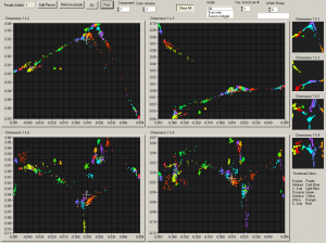
The PCA plot below shows me as a large cross in relation to different reference populations (like Europeans, Africans, East Asians etc).

Here’s what he said:
We also do quantitative tests. These come in three flavors, first without South Asia (represented by Pakistan) and the Mideast, second with South Asia, and finally with all three, as comparison panels.
The typical random error in the data (standard deviation) is 1%, meaning that numbers less than about 2% are not highly significant. There are also systematic errors. In particular, there is cross-coupling of values for Europe, the Mideast and S. Asia. For example, on the middle panel, a pure, northwestern European measures about 9% S. Asian, and on the third panel they typically measure 4.5% Mideastern and 8% S. Asian. Actual people from South Asia or the Mideast always test at least 15% European.
His first panel:
| Europe | 71.1% |
| East Asia | 12.3% |
| Africa | 8.2% |
| Oceania | 4.7% |
| America | 3.3% |
When South Asia is added:
| South Asia | 48.7% |
| Europe | 36.8% |
| Africa | 5.8% |
| East Asia | 5.0% |
| Oceania | 2.4% |
| America | 1.2% |
And finally when Middle East is added to the list:
| South Asia | 46.9% |
| Europe | 29.0% |
| Mideast | 11.0% |
| East Asia | 5.1% |
| Africa | 4.3% |
| Oceania | 2.3% |
| America | 1.4% |
And here is his analysis of these results:
This is basically a person from somewhere in region from say Iraq to Pakistan, with a substantial African contribution. The East Asian is probably not real. The African could be a few percent direct recent admixture, or it could be in input from a previously mixed population like the Makrani of Pakistan. My techniques can’t tell them apart.
The most interesting thing here for me was the African percentage.
1 comment
Comments are closed.